Dated Digital Exhibits

Recently in class we’ve been discussing the creation of online exhibits.  We were asked this week to find an online exhibit from a public history institution and critique it, thinking about what works and what doesn’t work, what we’d change, etc.  Many of my classmates chose to consider fancy (and probably expensive) exhibits created by institutions like the National Museum of American History or the National Portrait Gallery.  I initially thought about critiquing an exhibit closer to home and looking at the online exhibits from the Women and Leadership Archives (WLA) or the University Archives here at Loyola.  On more careful consideration, however, these institutions felt a little too close to home.  After all, I do work at the WLA and personally know the people responsible for its two online exhibits.  So I decided perhaps focusing on these exhibits wouldn’t be the best idea.

Instead, I decided to take my idea of closer to home literally and look for an institution in Ohio (my home state) that utilizes online exhibits.  I was disappointed to find that the Western Reserve Historical Society does not have any online exhibits, so I instead looked to the Ohio Historical Society.  Given the ridiculous winter we’ve had here in Chicago, and the even worse winter I know my family and friends in Ohio have been having, it seemed only fitting to explore the Ohio Historical Society’s exhibit Severe Weather in Ohio.

Severe Weather in Ohio Logo

It’s actually just called weather if you’re from Ohio.

The exhibit is based on extreme weather events from the book Thunder in the Heartland: A Chronicle of Outstanding Weather Events in Ohio, by Dr. Thomas Schmidlin and Jeanne Appelhans Schmidlin.  While the exhibit did not say when it was created, the book itself is nearly 20 years old, so I wonder if the exhibit itself is also older than many we might see today.

The first thing I noticed about the exhibit is the length of the introductory text.  Weighing in at a whopping 753 words, saying there is too much text on this page would be a gross understatement.  While the information provided on this page is interesting, much of it is not necessary.  No one would design a physical exhibit with that much text at the beginning, so why would you design a digital exhibit that way?  In addition, the exhibit content only took up about half of my laptop screen, with black space on either side.  This just accentuated the overwhelming feeling of the text and made it seem even longer than it was.

Only half of the text on the first page of the Severe Weather in Ohio exhibit

The introduction had me worried, would the rest of the exhibit be this wordy?  Luckily, this was not the case.  While I personally would have still cut down some of this text or attempted to break it up more with smaller paragraphs, the information on the individual events pages is much more manageable from a user standpoint.  I liked that each page included at least one photograph, newspaper article, or drawing associated with the severe weather event which you can click to enlarge and read more about.  Each page uses one graphic incorporated into the text in the top left corner and if there are other graphics they are provided all together at the bottom.  I would have liked to see these images incorporated into the text as well to break up the flow and make it feel like they are actually part of the story, rather than simply extras.  Additionally, this would have allowed for more creativity in the design of each page, making the exhibit more visually engaging.
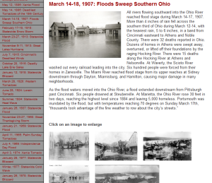
This page of the exhibit discussing a 1907 flood would have been more interesting if the photos at the bottom had been integrated into the text.

I don’t mean to only be critical of this exhibit, because it is actually fascinating.  Each page discusses what happened during this freak weather event, explores why it happened, and explains how the event affected the people of Ohio.  From a hurricane on the Great Lakes in 1913 to the 28 tornadoes that ripped through Ohio in one day in 1992, the content of this exhibit is actually really interesting.  I also like that the exhibit designers incorporated audio and video of these events when available.  Another feature that I appreciated was the weather glossary which could be found on the top bar of every page.  Clicking this link provided definitions of weather related terms used in the exhibit that visitors might need more explanation of.

From what I can tell, the main flaw in this exhibit is that it is old.  I don’t know exactly when it was created, but I would guess it was at least 5 years ago and probably more like 10.  For me, this begs the question when do digital exhibits end?  While I did not attend the session at NCPH 2014 that discussed this very issue, I did see people discussing it on twitter and I found it intriguing.  Physical exhibits, the presenter argued, have a definitive lifespan.  Temporary exhibits have an obvious and easily quantified lifespan, but even permanent exhibits aren’t really permanent.  These exhibits get revamped, have the objects rotated, and have new text written.  Eventually, they are taken down and entire new permanent exhibits—even if only new in design rather than content—takes their place.

But what is the life cycle of a digital exhibit?  Should there be a life cycle?  I would argue yes.  The digital world changes so quickly that an online exhibit will look old, worn out, and embarrassingly dated much sooner than a physical exhibit will.  While it obviously takes additional time and money to redesign or replace online exhibits, it will ultimately create content that is more engaging for visitors and that encourages interaction.

Where Does a Story End? Pottermore and the Extension of the Book Experience

“No book is a single thing” writes Bryan Alexander in his 2011 book The New Digital Storytelling.  In the eighth chapter of this book, “No Story is a Single Thing; or the Networked Book,” Alexander explores the idea of what is a story and, more specifically, what separates a story from the rest of the world.  He asks where a story begins and ends, noting that these questions are harder to answer in our digital age than they were in the past.

Alexander writes that today, authors have three choices:

  1. To actively embrace networking and the multiple layers and platforms it allows.
  2. To accept the network environment, but not really engage with it.
  3. To secede from the network environment and create something totally separate from it.

For Alexander, the networked book can be anything that extends and links the author’s content to the larger world.  This can take many forms, from wikis to podcasts, blogposts and fan fiction.  Alexander cites instances where authors blog about their process while writing a book, provide additional information that had to be cut out, or allow—or perhaps do not actively discourage—the creation of user generated fan fiction.

Alexander makes it a point earlier in The New Digital Storytelling to stress that digital storytelling occurs over multiple platforms and can fit into multiple categories at once.  He discussing both social media and gaming as modes of digital storytelling, so I was surprised when he did not discuss the Harry Potter universe’s Pottermore as an example that combines both of these aspects while questioning where a book ends.

Pottermore home screen

Pottermore home screen

For those unfamiliar, Pottermore bills itself as a “unique online experience […] built around the Harry Potter books.”  Launched in 2009, Pottermore is an interactive retelling of J.K. Rowling’s Harry Potter stories.  Users proceed chapter by chapter through the books experiencing aspects of the novels such as shopping for school supplies at Diagon Alley, being sorted into one of the Hogwarts houses, and de-gnoming a garden.

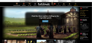
In this scene from Chapter 15 of Harry Potter and the Chamber of Secrets, users must find and then follow the spiders.

In this scene from Chapter 15 of Harry Potter and the Chamber of Secrets, users must find and then follow the spiders to learn the truth.

While experiencing the world of Harry Potter in each chapter, the user discovers new information about the series that Rowling had to cut from the books: fascinating back stories, insights into Rowling’s creative process, and original information that was changed before the books were published.

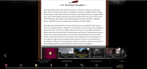
In the scene for Chapter 1 of Harry Potter and the Sorcerer's Stone, Rowling provides additional information about Privet Drive.

In the scene for Chapter 1 of Harry Potter and the Sorcerer’s Stone, Rowling provides additional information about the creation of Privet Drive.

But the user does not experience Pottermore in isolation.  The site is also a social platform where users win points for their house by concocting potions and engaging in wizards duals with other users.

Pottermore is everything Alexander would say defines a “networked book” and then some.  It blurs the lines around the Harry Potter universe (the Potterverse to the initiated), which are already extended beyond just the books to include a movie franchise and an incredibly active amount of speculation, theory, and fan fiction created by fans.  Pottermore extends the Potterverse even further by actively engaging with users and encouraging them to experience the universe for themselves while providing them additional information about the universe that goes beyond what was originally written in the books.  It is a fascinating site and a perfect case-study to showcase what Alexander calls the combinatorial storytelling inherent within the networked book.

Preservation and Ephemerality in Public History: Reflecting on NCPH 2014 from a Mile High

Another great post in our series reflecting on NCPH 2014.

The Lakefront Historian

This post is part of a series from Loyola public historians attending NCPH 2014.

I am currently sitting in the Denver airport on my layover to Chicago after a fantastic annual meeting of the National Council on Public History.  I was reluctant to leave sunny Monterey for the snowy Midwest, but as always I feel invigorated the conversations with other historians committed to engaging and serving the public.  Two panels in particular remain fresh in my mind as dynamic counterpoints that framed the conference’s theme of sustainability: one on preservation, the other on ephemerality.

People > Things

It occurs to me that the title of the panel on “Sustaining Historic Preservation Through Community Engagement” should’ve be swapped around to read, “Sustaining Community Engagement through Historic Preservation,” as it became clear through the course of the panel that preservation should be used in the interest of community engagement and not vice…

View original post 198 more words

Public History Has Revisionist Roots, and the NYT Is ON IT

The Lakefront Historian

This post is part of a series from Loyola public historians attending NCPH 2014.

The public historians assembled here in sunny Monterey spent their first day and a half covering what has become familiar yet still challenging ground for those of us in the profession. In round-tables, poster sessions, panel sessions, and working groups, they swapped insights on the cultural work that goes into interpreting an increasingly inclusive past to a likewise increasingly diverse public. The sessions I have attended include those about museum exhibits “co-created” with community members, the latest in attempts to interpret slavery at historic sites, my own working group about innovative reuse of “less-than-charismatic” structures, and sustaining public history though community engagement. Implicit in all these topics is the internalized impact of social history and the commitment to embracing marginalized voices—-both historical and contemporary. I actually feel that this laudable aspect of public history has…

View original post 562 more words

Gender: Just Add Women and Stir?

This post was originally published on The Lakefront Historian, the Loyola Public History student blog, as part of a series from participants at NCPH2014.

We’ve all seen it.  When museums, historic sites, and textbooks realize they need to address gender, the go-to response is to “just add women and stir.”  Sprinkle in a few “great women” to go with the great men or specifically talk about the women who lived in a historic house…usually only when you enter the kitchen.  The traditional male dominated history isn’t challenged in any way.  It’s still the same story, the same narrative, the same interpretation of the site, but now women have  been “included.”

The first panel I attended yesterday morning at NCPH 2014, “Gender: Just Add Women and Stir,” sought to challenge this standard trope.  The facilitators, a number of whom were from the Pew Center for Arts & Heritage in Philadelphia, had taken a study trip in 2013 to historic sites in New England to observe how gender and sexuality were interpreted—or not interpreted—at these sites.

Rather than a traditional panel where the audience is talked at, we immediately began an activity.  The panelists had placed scenes from historic house museums around the room and asked the audience to interpret each room in terms of gender and sexuality.  At first many participants seemed hesitant to imposing any sort of interpretation on these sites.  How were we supposed to interpret gender and sexuality based solely on images without any context?

As someone who attempts to be aware of assumptions and stereotypes based on gender and sexuality, this felt like an exercise in reifying useless categories and stereotypes.  What makes a room, or aspects of it, “masculine” or “feminine?”  Are we talking about 19th century views of masculinity and femininity or 21st century views?  Since societal views about these things aren’t static, but have in fact changed tremendously, there is considerable difference.

As far as interpreting sexuality goes, well there’s all sorts of trouble there.  The living room at the Gropius House in Lincoln, Massachusetts, for instance totally said gay stereotype to me.  Not gay, mind you, but gay stereotype.  I have no idea who used or designed this living room, and I can’t make any sort of judgements about their gender, let alone their sexuality based simply on an image of the room.

The image used in the session was a different angle, but you get the idea.

The image used in the session was a different angle, but you get the idea.  Photo courtesy of www.historicnewengland.org

What was great about this activity, however, was that quickly people began asking questions, rather than imposing interpretation.  Who is using this space?  Who designed the space?  Are they the same person?  Who cleans the space?  What kind of activity is going on here?  What assumptions about class can we make by looking at this space?

The questions  quickly showcased the most important point I came away with from this panel: intersectionality.  This concept isn’t new to anyone studying historically marginalized and underrepresented groups, but it is important to emphasize.  Basically, the idea of intersectionality says that our various identities in general, and oppressive institutions in particular, are interconnected and cannot be examined separately.  The experiences of all women aren’t the same.  Our experiences are colored not only  by our gender, but also by our race, our class, our sexuality, etc.

While we as scholars know this and can acknowledge this fact, our historic sites just aren’t always doing this.  How can we encourage sites not only to “add women” but to explore their experiences in a nuanced way that challenges traditional historical narratives?  Simply adding women but leaving male dominated narratives in tact isn’t enough anymore.

The issue of sexuality becomes even more difficult.  Often sites will say there simply isn’t documentation to support an analysis of a historical figures sexuality.  If there’s no documentation confirming that a figure wasn’t heterosexual, then it can’t be addressed.  But this is an excuse.  To me, this is especially frustrating because you’ll never see anyone saying we can’t assume someone was straight simply because there is no documentation to confirm that fact.  Heterosexuality is the default, and anything else needs to be proven.  I’m not asking that, for instance, the Frances Willard House start telling everyone that the WCTU leader was a lesbian.  But I am asking that they address the fact that she never married, had long-term female companions, and found her most meaningful relationships with women.  In the late 19th and early 20th century this didn’t mean you self-identified as a lesbian—that word didn’t even exist—but today it might mean that you would.  This needs to be discussed outright, not only in whispers.

I left the session realizing that some institutions might say they don’t address gender or sexuality within their interpretation.  But this isn’t true.  All institutions and historic sites address gender and sexuality (and race, class, etc) whether they actively talk about it or not.  Unless the interpretation at your institution actively discusses gender and sexuality, then you are silently upholding the heteronormative male narratives of traditional history.  Historical scholarship has moved well past this.  Historic sites need to do the same.

Greetings from California!

Flickr/Shyntyrr (Creative Commons License)

Flickr/Shyntyrr (Creative Commons License)

Apologies to all of my fellow mid-westerners reading this, but it is sunny and warm here in California.  If it’s any consolation, I’m currently sitting at the LAX airport for the next 7 hours, so I’m not really enjoying the weather.

I left Chicago early this morning to head to California for the next few days for the National Council on Public History (NCPH) conference in Monterey.  I was lucky enough to be one of only five students to receive a graduate student travel award from the NCPH and am incredibly honored to be on my way to this exciting conference.  It’s my first real conference guys (sorry HGSA conference, grad student conferences don’t compare to the real deal) and I am incredibly excited.  These are the kinds of people I will (hopefully) be spending the rest of my professional career with!  Here’s to hoping it’s a good time.

Not that I’m only here for the experience and the sun.  The fabulous Kim Connelly Hicks and I are presenting a poster titled “Addressing Absences: Exhibiting African American Suffragists” at the poster session Thursday evening.  This poster is based on an exhibit proposal, Kim and I along with our other colleagues Maisie O’Malley and Liz Nyden created last year which focused on the experience of African American suffragists in Illinois.  The poster and our presentation will focus on the challenges of creating a traditional exhibit when source materials exclude, neglect, and silence the exhibit’s subjects.

The result of Kim and my creativity and publisher skills.

The result of Kim and my creativity and publisher skills.

If you’re interested in the conference and to hear about our experiences, my colleagues and I will be blogging about our trip on the fantastic Loyola History Graduate Student blog, The Lakefront Historian.  I’ll also be cross posting what I write here, but I’d encourage you all to check out the posts everyone else writes as well.  If you want a rundown of the exciting things everyone is doing at the conference, check it out here.

Website Redesign

Recently our new media class was split into groups and asked to try our hand at creating a new website for the Glessner House Museum, a historic home here in Chicago. If you visit the Glessner House website, it’s fairly obvious why the site needs to be updated.  It seems clunky and dated, like it hasn’t been updated in 10 years.  In reality, however, the content of the page is well-maintained and updated frequently.  But the appearance turns you off.  I think most active internet users would agree that a good website can turn you on to a new product or organization while a bad website can completely turn you off of something you were initially interested in.  I have never visited the Glessner House, but if I was exploring options for museums in Chicago, a visit to this website would lead me to cross the Glessner House off my list.

The current Glessner House website

The current Glessner House website.

Of course, the Glessner House is a relatively small organization.  They do not have the funds to operate a dynamic website the way better funded organizations like The Field Museum can.  While a great website can be expensive and time-consuming to maintain, it doesn’t have to be.  With the advances in free and low-cost site hosting platforms, an attractive website can be a lot easier to create than some might think.  Sites like wordpress.com (where this blog is hosted, for instance) provide you with templates and themes to create a website without having knowledge of HTML.

WordPress is what my group chose to use for our version of the Glessner House site.  Overall, I was happy with our final product.  Our version of the site has a sleeker look to it, and it breaks up much of the content into more manageable chunks than the original site.  Like any project, however, there were some things that went really well and problems we would hope to avoid in the future, some of which were unique to the fact that this was a collaborative project on a digital level.

The homepage of our snazzy redesign.

The homepage of our snazzy redesign.

One advantage to working on a digital project, especially over spring break, is that we were able to redesign the site working entirely remotely.  Half of our group was out of town for the week, a traditional project would have been a major hassle to coordinate in those circumstances, but a digital project proved incredibly easy.  A short meeting after the project was assigned allowed us to decide on a platform to create our site with and to divide the workload.  After that, it was simply a matter of each person working on his  or her individual portion of the site and communicating about our progress via email.  Unlike splitting up the work for a traditional project, we were all able to monitor what changes looked like in real time and in the context of the final product.  This made it simple to suggest modifications to each other without having to wait until a section was completed and sent to the group for revision.

We chose to use WordPress for our site because everyone in our group was familiar with the way this platform works and how to create content.  While I like WordPress, it might have been interesting to explore other sites.  Some groups, for instance, made fantastic looking new sites using wix.com.  Unfortunately, no one in our group had ever used this platform before.  With varying levels of digital experience under our belts, the thought of everyone learning to use an entirely new site seemed daunting.  If any one of us had been redesigning the site by ourselves, I think it would have been much easier to explore a new hosting platform and experiment with that.  Working together, but remotely, we decided to use what we knew, rather than make things more difficult and attempt to learn the intricacies of a completely new site.

But even using a platform we all knew well, we ran into a few problems with our design.  Originally, we had hoped to create a slide show display of photographs for our homepage.  We chose a theme (prepackaged templates that allow you to choose the “look” of your wordpress site) which appeared to have this capability, but when we explored our appearance options we could not find a way to create the slide show affect.  WordPress allows you to upgrade your site theme for more customization if you pay a set fee, so perhaps if we had been in the position to pay for an upgrade we would have been able to create the slide show we desired.

Overall, however, our redesigned site was a success.  Our group was able to work efficiently despite being in different states because we all understood how to use the platform and because we were all able to see the final product in real time whenever an edit was made.  While our own varied digital knowledge and our inability to work together in person meant that we were unable to explore different possibilities, we were still able to create a site that is both easily navigable  and visually appealing.